Overview
888poker is the fastest-growing online real money poker room and has been a forerunner in the online gaming industry.
Problem
1. The design of the 888 poker table looked outdated and overloaded with confusing order of UI components.
2. The feature creep was an obstacle that required an overall revamping that will help ensure that the 888 poker table can remain competitive in the long run.
3. A significant decrease in inactive players and the growth of competitors led to the demand for a new product design.
Goals
Attract recreational players to offer them a freemium-like environment with the responsibility and safety of the real money conventions.
Attract recreational players to offer them a freemium-like environment with the responsibility and safety of the real money conventions.
My Role
1. I led the project and worked on all aspects of the new table design, including its visual, UX and motion design.
2. Revamped every key feature while product managers enlighted me with valuable user information and my developer colleagues helped implement my designs.
1. I led the project and worked on all aspects of the new table design, including its visual, UX and motion design.
2. Revamped every key feature while product managers enlighted me with valuable user information and my developer colleagues helped implement my designs.
Solution
1. Create a brand new look and feel to assure the 888 poker table encompasses up-to-date aesthetics and usability across all features of the game.
2. Improve the game experience for better engagement for all player's levels.
1. Create a brand new look and feel to assure the 888 poker table encompasses up-to-date aesthetics and usability across all features of the game.
2. Improve the game experience for better engagement for all player's levels.
Challenges
1. Design the table to ensure every new upcoming feature will have its designated place without having to make extreme rearrangements for new upcoming features.
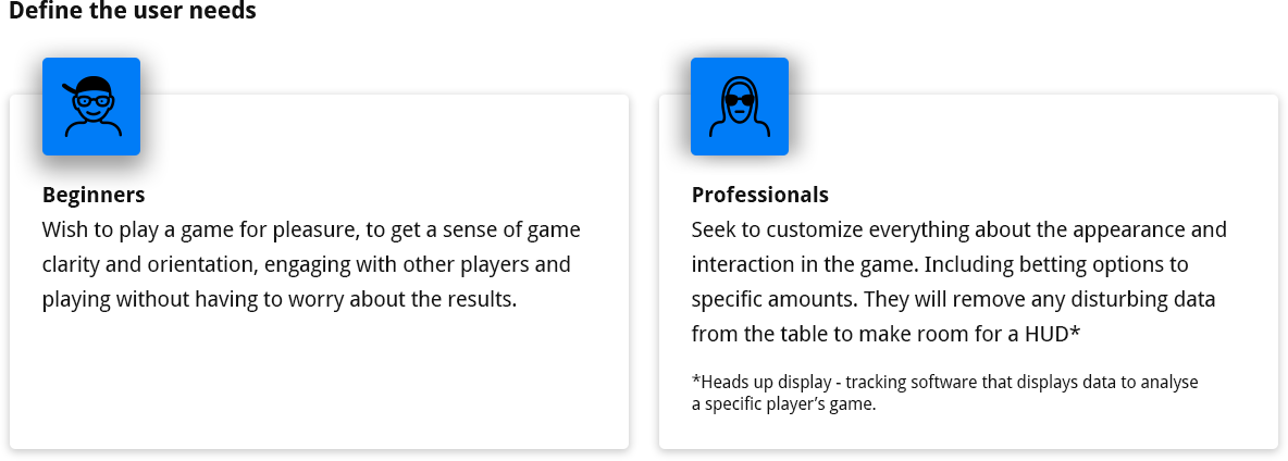
2. Understand how to incorporate beginner and professional features in the table despite their contradiction.
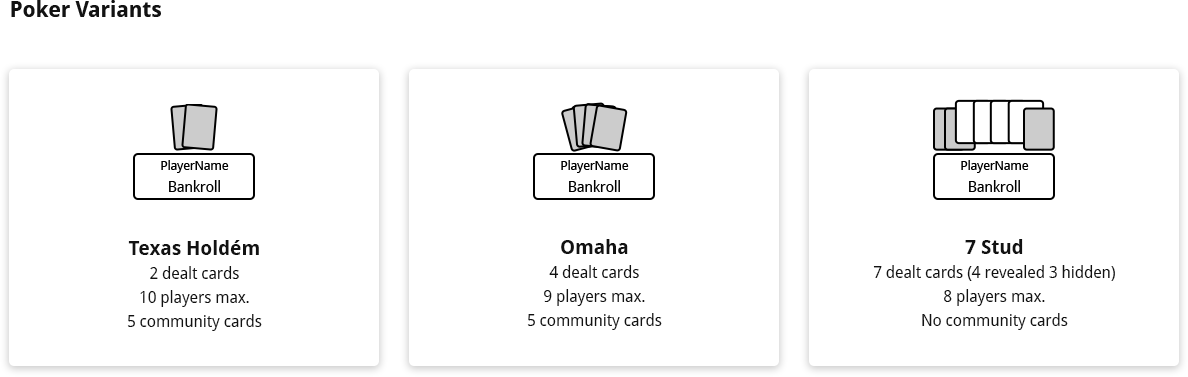
3. Design a player's area that will support all game variants.
1. Design the table to ensure every new upcoming feature will have its designated place without having to make extreme rearrangements for new upcoming features.
2. Understand how to incorporate beginner and professional features in the table despite their contradiction.
3. Design a player's area that will support all game variants.
Market impact and outcome
The desktop update was released in the second half of 2019, increasing revenue share by 7%. The update received very positive customer feedback, and In 2020 the revenue share increased by 47.8%. Redesigning the desktop was the first step toward improving the product. As a result, it won two PokerListings.com awards: "Best beginner software" and "Most improved software".
The desktop update was released in the second half of 2019, increasing revenue share by 7%. The update received very positive customer feedback, and In 2020 the revenue share increased by 47.8%. Redesigning the desktop was the first step toward improving the product. As a result, it won two PokerListings.com awards: "Best beginner software" and "Most improved software".
Let's get into the details
Research
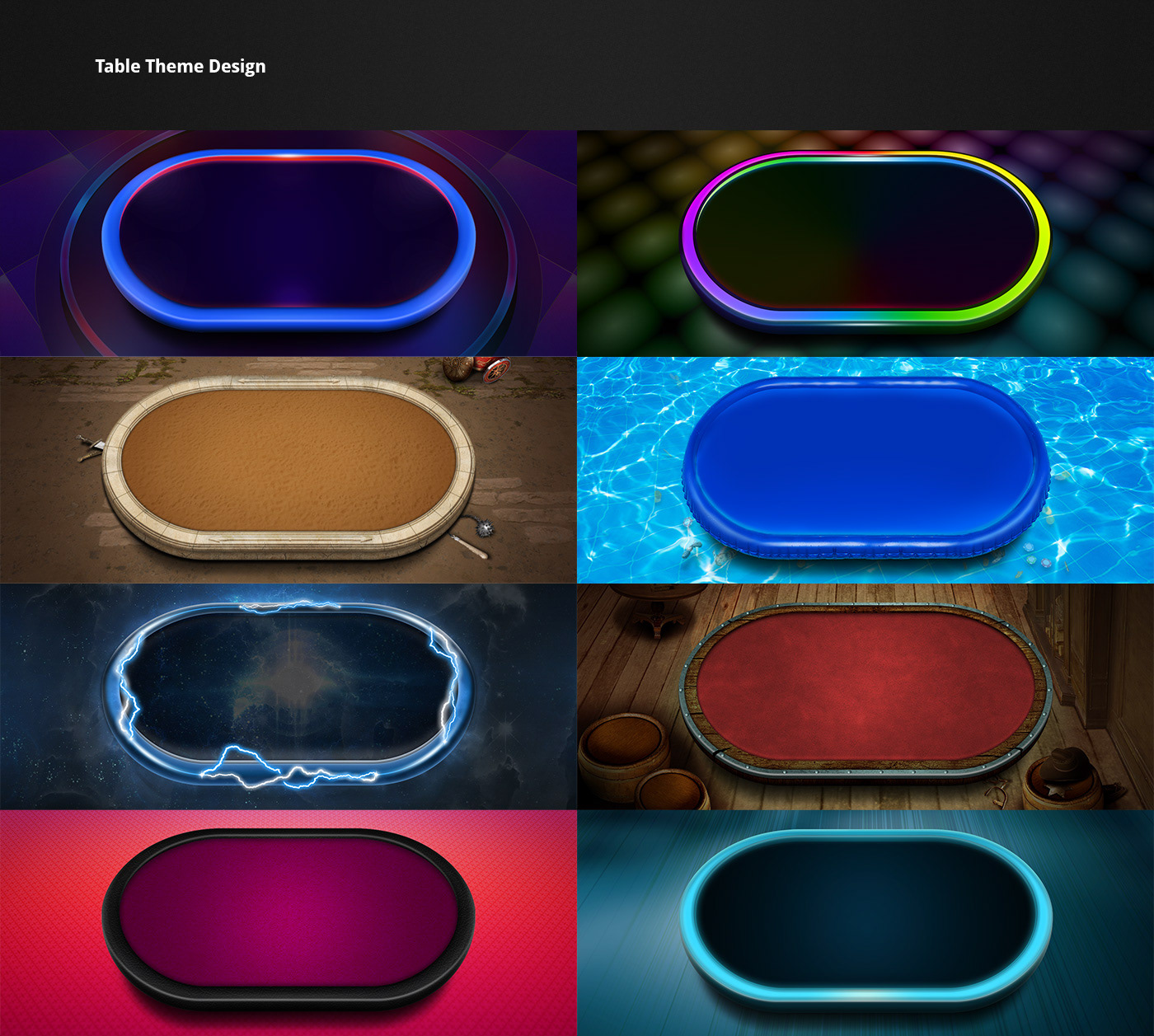
Competitors Research
Examining the leading real money and free-to-play poker clients, brought to the conclusion that a 3D-like environment became a convention in the industry. While all game components are strictly conventional they allow a wide range of visual interpretations.
Examining the leading real money and free-to-play poker clients, brought to the conclusion that a 3D-like environment became a convention in the industry. While all game components are strictly conventional they allow a wide range of visual interpretations.
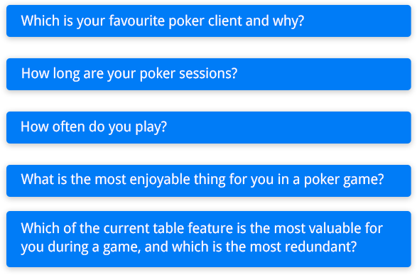
Empathising with Players
Great data about the player's habits, wishes and dislikes were gathered by marketing managers and analysts. Which described the poker players as casino players too. Additionally, I conducted short interviews with many stakeholders, some of them were professional and semi-professionals and some were fresh poker players.
Great data about the player's habits, wishes and dislikes were gathered by marketing managers and analysts. Which described the poker players as casino players too. Additionally, I conducted short interviews with many stakeholders, some of them were professional and semi-professionals and some were fresh poker players.
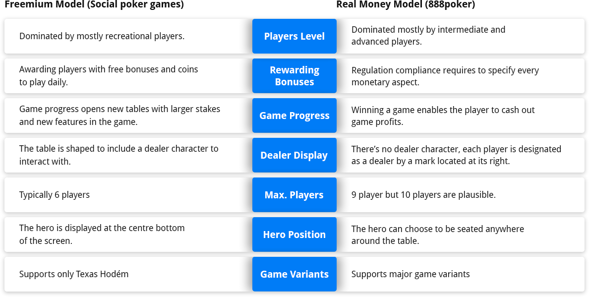
Online Game Models
Ideation
Mapping the features
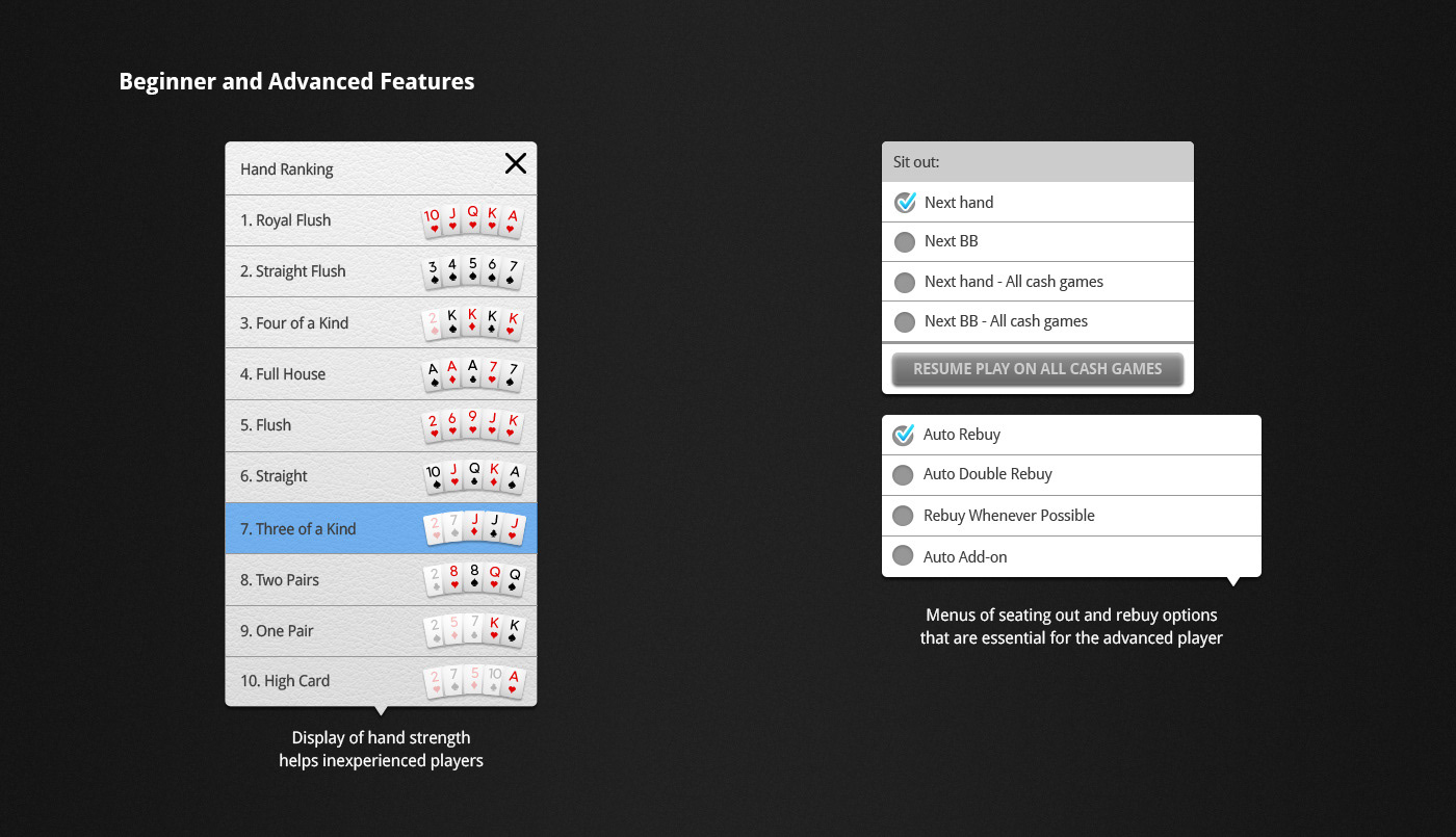
I began prototyping for two major personas by mapping the mandatory features of beginner and advanced payers that must be displayed to enable a fluent play. Understanding that a feature which is essential for the beginner is ignored by the professional while preferring beginner’s features in the favour of the advanced for the default state. Single actions were designated from multiple choices and enabled them to switch off all beginner’s features in the settings menu to allow the advanced personalized environment suited for their needs.

Prototype
Bringing it all together
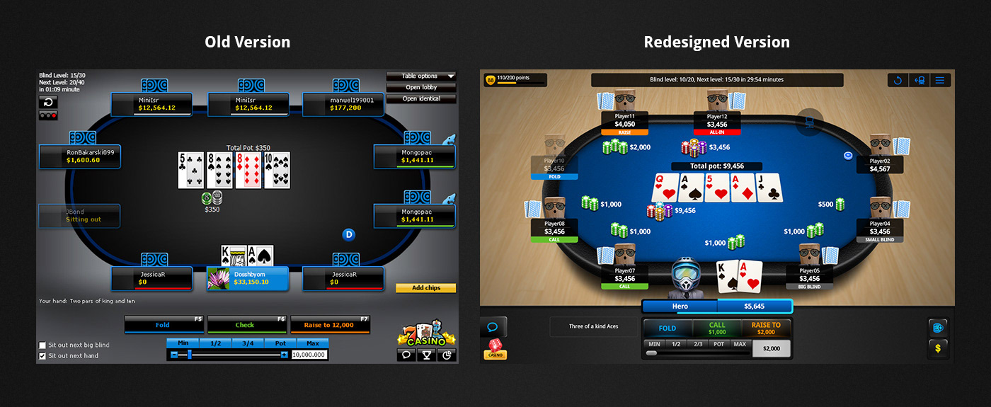
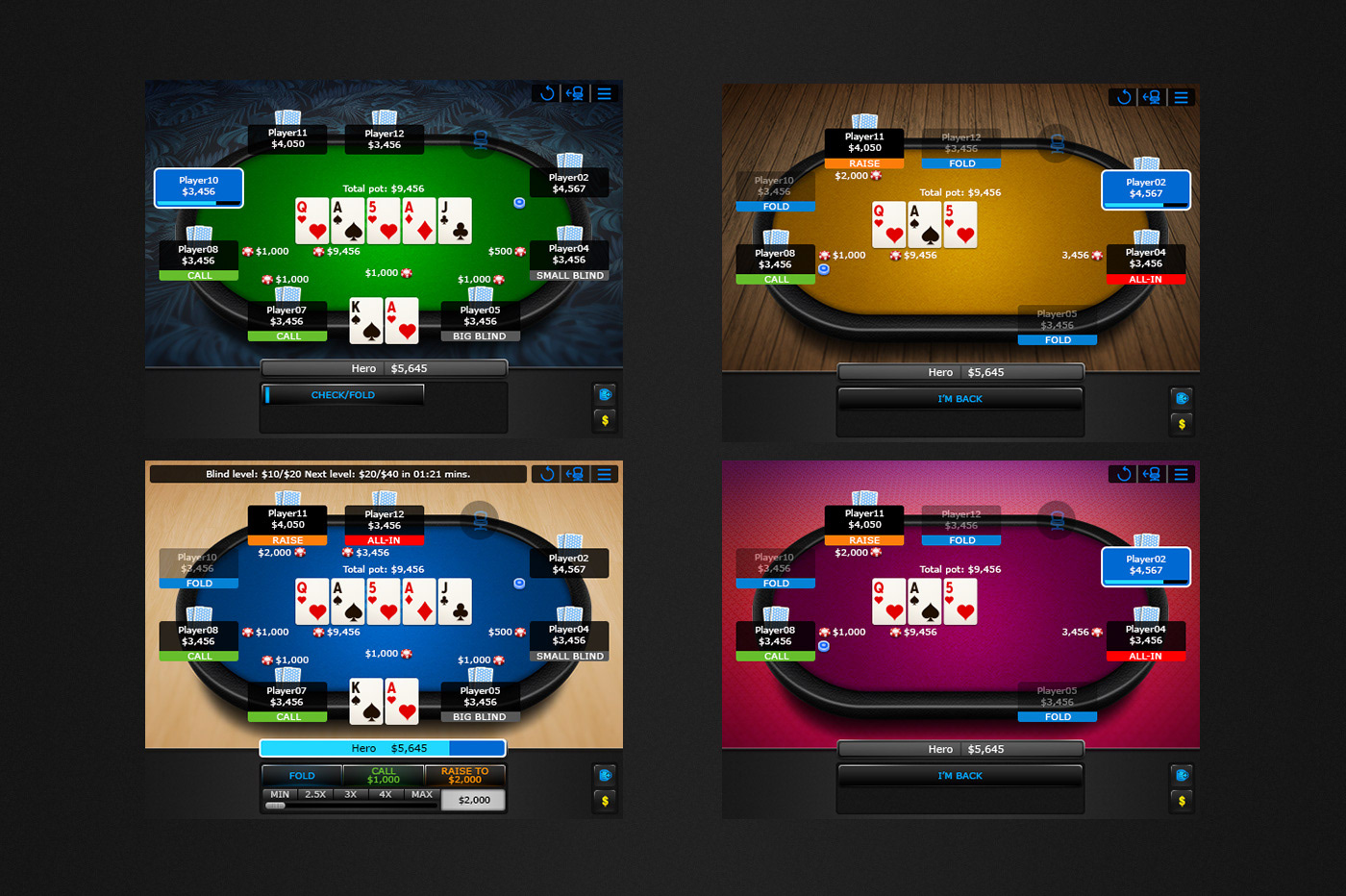
I designed the table with a 3D table perspective with leather and felt textures while building a scene of a birds-eye view to create a controlled feeling of the game. Advanced features were designated to drop-down menus separated by the purpose of use (sit-out options and table display options).
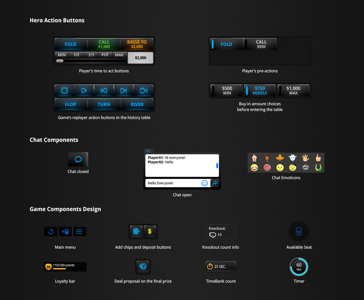
I arranged the single choices in the bottom area in which the player controls and performs actions. Arrange the hero time to act choices in a way that a minimum move of the mouse would be necessary. Communicating every single UI component in the game has been done with extended use of tooltips explaining the meaning of every icon and action.
I arranged the single choices in the bottom area in which the player controls and performs actions. Arrange the hero time to act choices in a way that a minimum move of the mouse would be necessary. Communicating every single UI component in the game has been done with extended use of tooltips explaining the meaning of every icon and action.

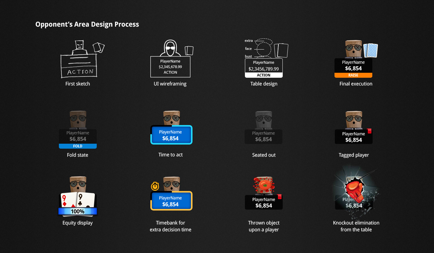
Opponent player area
The component consists of an avatar, a player’s nickname and an amount for bankroll. It’s a dynamic component that changes every time during a game round. Whether it’s the player's time to act or action performed and if extra decision time is needed. There are dozens of features to display upon a player that will give valuable information to the hero.
Improve usability for game components
Before the player gets his/her time to act he/she can decide which action to perform and this action is called a pre-action. It is designed as a radio button in the exact place of the action to allow focus and ease of use. Besides the must-have game components, additional engaging features also had to be included. Like a loyalty Bar that tracks the player's gameplay and displays levels and points and a chat area with special emoticons for poker players. Latin and Cyrillic language support led to the spacious design of the buttons and extended use of icons.
Applying features to the basic prototype
Minimized Table Design
The minimized table is an 888 poker key feature that had to be
re-examined separately from the main table. This mini-table enables the advanced player to play up to 16 poker games at once while having a quick view of every table status. All the features that were lack of value for the professional player were removed. Additional table assets were reduced to minimum visibility. The goal was to keep the essential components crystal clear to enable fluent decision-making for every table on the screen.
re-examined separately from the main table. This mini-table enables the advanced player to play up to 16 poker games at once while having a quick view of every table status. All the features that were lack of value for the professional player were removed. Additional table assets were reduced to minimum visibility. The goal was to keep the essential components crystal clear to enable fluent decision-making for every table on the screen.
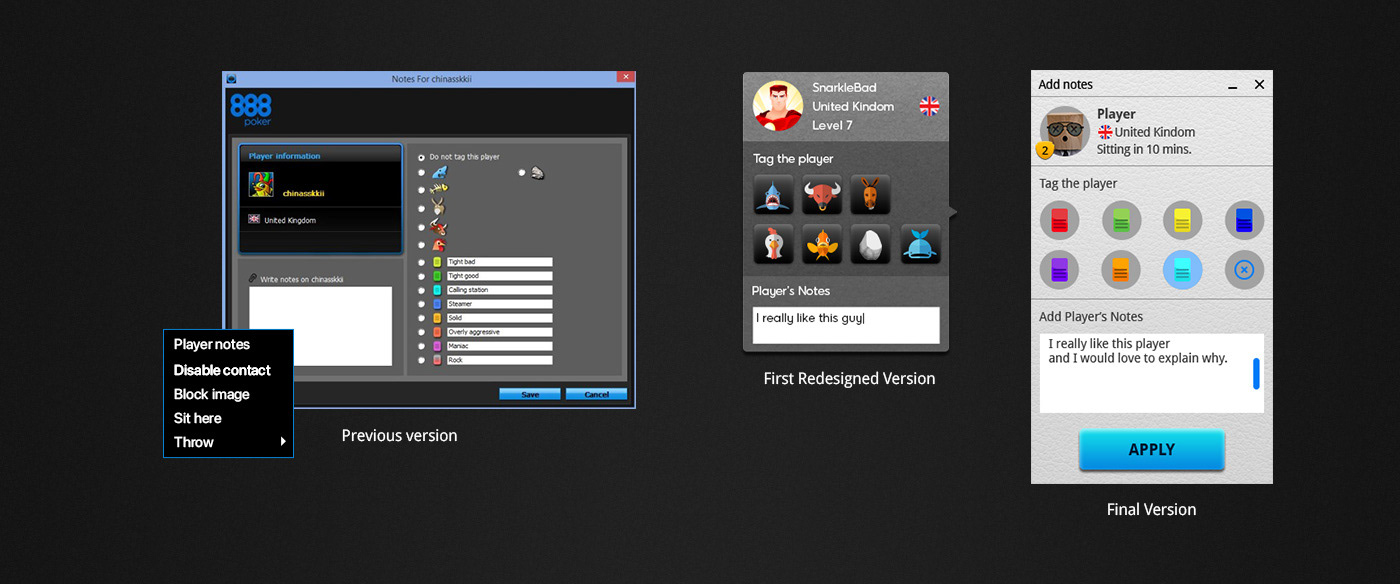
Tag pop-up
Tagging a player is a personal tool for the hero to label opponents' activity during the game, it's considered a feature for intermediate and advanced players.
Previous version problem
Reaching the tagging panel required a lot of attention from the player. The menu was a large pop-up of more than ten options to tag, which included a list of animals and coloured tags. The coloured tags included input texts already indicating which colour to tag each type of player, additionally, there was an input text box to add personal notes.
Current version solution
To reduce the number of choices the tagging by animals was omitted after consulting with mainly advanced players. Tagging by colour was selected as the only method to tag while keeping the colour interpretation free for the player. Taking personal notes is also a professional request that remained in the tagging tool.
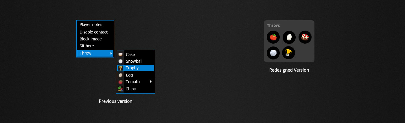
Throw object menu
Throwing an object upon a player is a special feature of 888poker and is popular among all users. The previous version opened with 2 phases of the selection process. In the current version, we decided to open the menu by right-clicking the opponent’s area. I designed the menu to be more engaging and accessible with illustrated items that saved selection time and animated the thrown object's impact upon a player.
Testing
Getting feedback from players
First, we introduced the prototype for influencers and then conducted an A/B test. The user's response changed dramatically from those who favoured the change and found it intuitive and easy to use, then those who were indifferent to it. The users who favoured the new table revamp welcomed it happily and advocated its sleek look and feel and its engaging appearance. I learned that such a big change for users who were well accustomed to the previous version is quite a big issue. So to communicate the makeover to the players, we conducted a user guide for every changed feature.
Conclusion
Compared with the previous version of the table, the new design made a significant impact on the poker industry. In the end, the results increased revenue share and received positive feedback from customers, and won 2 prestigious awards at the 2020 poker listings operator awards.
Although from the side the project seemed manageable after immersing in it revealed a world full of endless problems and possibilities to improve the user experience for poker players. I learned to keep asking for constant feedback and to try to push for ease of use over the default urge to bring everything up front to ensure the project’s success. I’m looking forward to applying the same approach to other future products

More information on this project is available here